I recently had to put together a collection of tools for "thinking visually" and thought it would be good to share it here. It is basically a collection of tools for you to try.
The starting point was finding ways to display quantitative information but we also had to cover the creation of more emotive or softer images that communicate an idea, maybe very effectively, with less reliance on the numbers.
The starting point was finding ways to display quantitative information but we also had to cover the creation of more emotive or softer images that communicate an idea, maybe very effectively, with less reliance on the numbers.
My mind is always drawn initially back to this image, which plots Napoleon's Army's size, position, direction and even the weather into one chart.


If you want to work collaboratively developing your ideas then Google Drawings are great. I've found them to be really useful when designing something like screen wireframes because you can invite collaborators to look at your diagrams and have them comment on the individual items in your diagram ( see above ).
And with generic tools you can also create flow charts, storyboards, regular diagrams, hierarchies and taxonomies etc. Each of the tools below have huge libraries to help with different diagram types.
I'd recommend you give one of these diagramming tools trial remembering that there's almost nothing you can't do with boxes, circles and lines.


If your data has dates in it, then it is always interesting to see it in a timeline. One of my favourite tools, dipity lets you add images, and YouTube videos to a timeline but you can also view them as a slideshow.

Tagclouds take a large body of text and present the words that are used the most the biggest. Above is the content of a speech by Barack Obama as a tagcloud.

Personally, I find brainstorms tend to be fast and furious and so only a pen and paper will do, but there are times, either after a face-to-face brainstorm has finished, or when you can't get together in real life that online brainstorm tools become useful.


From: http://en.wikipedia.org/wiki/Charles_Joseph_Minard and of course the books of Edward Tufte.
But we also looked at images such as this one, that looks at data gathered about attitudes to the Hijab in Denmark. I find it interesting that even though I can't see what the percentages refer to in the image below, I am blown away by the idea of a headscarf pie chart. In some ways, it almost doesn't matter what the data is, and whether the areas match the percentages or not, simply the idea of presenting it like this has me hooked and willing to look deeper... to engage.

And then there's the swathes of visualisations that look fantastic but don't really tell you anything. You can't argue with their beauty but they're almost unfathomable, like a picture of "everything ever" ( from here ).

And of course, there are any number of other brilliant ways to present information from infographics to animations.
Tools You Can Use
There are many tools that make producing charts or other structured data ( like mind maps or timelines ) much easier. However, often all you need for a great visualisation is a generic tool and great idea. For example, there isn't yet an app to do hijab pie-charts, nor should there be. There are tools to help creating tree maps ( one of my favourite visualisation types ) but you could equally create a tree map with a simple drawing tool and calculator to work out the areas needed.
A Graphics Editor: Pixlr
One of the first tools I recommend is Pixlr Editor. Pixlr is like a "Photoshop Lite" that runs in your browser, great for resizing and cropping and adding filters etc. http://pixlr.com/editor/. Chrome users can add it in the App Store here and Google Apps users can connect to their GDrive.
Whatever other tools you use, you will probably need to postprocess the image you create with something like Pixlr.
Whatever other tools you use, you will probably need to postprocess the image you create with something like Pixlr.
My only caveat about this app is that it doesn't let you do fonts bigger than 90pt but apart from that it's fantastic and always available if you have a browser to hand.
Diagrams

And with generic tools you can also create flow charts, storyboards, regular diagrams, hierarchies and taxonomies etc. Each of the tools below have huge libraries to help with different diagram types.
I'd recommend you give one of these diagramming tools trial remembering that there's almost nothing you can't do with boxes, circles and lines.
- http://lucidchart.com - integrated with Google Apps, available in the App Store
- https://cacoo.com/ - integrated with Google Apps, available in the App Store
- http://creately.com/
Mindmaps and Concept Maps
Mindmaps are great ways to help your ideas to develop and grow into new places. I personally find that mindmaps are often a useful process to go through, but can be difficult to "read" for the viewer, simply because they weren't involved in the "growing process". But having said that, I use them all the time.
Other online apps include:
- https://coggle.it Log in with your Google credentials.
- http://www.mindmeister.com/
- https://bubbl.us/
Infographics
At times my heart can sink when I see the word infographics simply because so many don't convey information at all, instead they collect together heaps of numerical soundbites and add a picture to each one. Don't get me started. Having said that, great infographics can be hugely informative and have a very strong visual presence.
Two tools that aid the production of striking infographics are:
Two tools that aid the production of striking infographics are:
- http://www.easel.ly/ ( essentially just a drawing tool )
- http://piktochart.com/ An easy tool for creating infographics. Lots of themes. ( log in with Google ) - I'm starting to really like this one, you can add basic data and use some simple but cool looking chart types ( and no, I don't mean 3D pie charts ).
- https://infogr.am Lets you edit basic data tables to create a variety of charts ( see the size chart below ).
Timelines
If your data has dates in it, then it is always interesting to see it in a timeline. One of my favourite tools, dipity lets you add images, and YouTube videos to a timeline but you can also view them as a slideshow.
- http://www.dipity.com/
- Tiki-Toki has been used for the 50 years of the University of York
- http://timeline.verite.co/
Tagclouds
Tagclouds take a large body of text and present the words that are used the most the biggest. Above is the content of a speech by Barack Obama as a tagcloud.
Tagclouds can often seem of dubious merit, but work really well as means of comparison. Below is a tagcloud of a speech by George Bush.

And here, an academic journal makes its content viewable as a navigable tool with additional tools to read the actual text and show word frequency in the sidebar (shown below)... incredible.

And here, an academic journal makes its content viewable as a navigable tool with additional tools to read the actual text and show word frequency in the sidebar (shown below)... incredible.

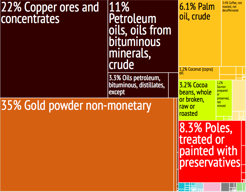
Treemaps
I think treemaps are poorly named, they are nothing like trees, but they still are one of my favourite visualisation kinds. A treemap is designed to help you understand the difference in proportion between amounts without bothering you with what the actual numbers may be.
I always want to see UK Government spending shown as treemaps, simply because budgets of billions become strangely meaningless when they're that big. You can imagine why most governments don't want you to see their data in this way, because typically a person looks at it and says, "We're spending HOW MUCH on X?!".
You can make treemaps from within Google Apps or with lots of other chart tools.
You can make treemaps from within Google Apps or with lots of other chart tools.
Cartoon and Comics
Although your first thought with a cartoon is probably that they're childish but tools to create comics are a great way to break your idea down into a discrete sequence. Love or hate IKEA flatpack furniture, the instruction comics are very good and barely use any textual language whatsoever.
Animation
Once your idea is in the format of a comic, it's not a huge leap of faith to consider if your idea would work if it was animated.
Poster Makers
These two tools are useful when you want to print your design.... BIG!
- http://rasterbator.net/ Multi-page posters from any image. The Rasterbator enlarges images to multiple pages, which you can then print and combine into huge posters. new!
- http://www.core77.com/blog/technology/better_than_the_rasterbator_convert_raster_images_to_vector_graphics_with_onull_15900.asp
Collaborative Visual Tools
Brainstorming
- http://www.designyourway.net/blog/resources/6-online-tools-for-visual-brainstorming/
- https://www.stormboard.com/ Sticky Notes but with voting
- Infinite virtual corkboard tool. http://www.spaaze.com/home Integrates w Google Drive
- http://groupzap.com/ Free for 7 days
- ConceptBoard - https://conceptboard.com - collaborative diagram making and doodling
Feedback Via Annotation
Sometimes you just need some feedback on your image.
- http://www.govisually.com/ 20 Free Tools To Annotate PDF Documents
- http://www.hongkiat.com/blog/free-pdf-annotation-tools/
Moodboards
Moodboards are often used to help groups define the visual tone when working together. In the past I have collected together heaps of magazines and people have ripped out images that fit their ideas.
- https://mural.ly/
- https://www.musepeak.com/
- http://www.moodshare.co/
- http://bitly.com/bundles/adrienne/9 List of tools
Pinterest - Not Just Cupcakes and Knitting Projects
Moodboards are good for curating a collection of ideas too. Sites like Pinterest let you collect together themes of web pages ( most of these web pages tend to be very visual in nature ) for example here is a Pinterest board collecting pages about collaboration with social media.

Pinterest is best once you've added the browser add-ons to make adding items to your boards really simple. You can also make "group boards" and share the task of collecting resources and web pages.
Here's a challenge. Imagine you were planning on creating a visual image, or visualisation with the theme of "forest". You maybe had an idea or some data that you wanted to represent with woodland feel. If you notice your first thoughts about what it might look like, or even your second thoughts after a few doodles, you might be happy with the direction of your visual design. Now go and look at a Pinterest search for "forests"... and see if your first sketchy ideas about forests have been pushed in a new direction.
Pinterest is a great site for helping with your inspiration, but if you want images that you can use, then it pays to understand Creative Commons and which images can be used, in which circumstances, without breaking copyright law. Here is a search on Flickr for Creative Commons "forest" images, look at this beautiful image I found.

Next post: Data-driven Visualisation Tools - A Resource List
Here's a challenge. Imagine you were planning on creating a visual image, or visualisation with the theme of "forest". You maybe had an idea or some data that you wanted to represent with woodland feel. If you notice your first thoughts about what it might look like, or even your second thoughts after a few doodles, you might be happy with the direction of your visual design. Now go and look at a Pinterest search for "forests"... and see if your first sketchy ideas about forests have been pushed in a new direction.
Pinterest is a great site for helping with your inspiration, but if you want images that you can use, then it pays to understand Creative Commons and which images can be used, in which circumstances, without breaking copyright law. Here is a search on Flickr for Creative Commons "forest" images, look at this beautiful image I found.
Source: Kamil Porembiński
- Sources of Creative Commons media
- 9 Place to find Creative Commons or Public Domain images
- Everystockphoto
- Flickr's Creative Commons
Great list Tom, I've bookmarked a few things I'd not seen before to try sometime.
ReplyDeleteOne other good one for timelines: http://www.tiki-toki.com. I did a bit of a review of options when we needed to put one together for the UoY 50th anniversary and it came out top (see http://www.york.ac.uk/50/history/timeline/ for what we did with it)
Wow! That looks great. I'll add 'em in.
ReplyDelete